The EnRoute Adventures blog has now moved to the new EnRoute site.

Wednesday, May 4, 2016
Monday, May 2, 2016
Time lapse of last Sculpture Magic Workshop
Through the years we have had numerous requests for a video of our workshops. We strongly believed that to properly experience a workshop you needed to be there, getting your hands dirty and engaging with us one on one. That belief hasn't changed. But thanks to our good friend JD who attended our last workshop we did capture much of it in a time lapse video. Even this is but a quick glimpse for it was only one room of the workshop and didn't include the meals, field trips or the things that happened outside.
There is so much going on at all times. Each time a question was asked we answered it verbally and also with a quick sketch or by referral to a handy sample. Much more than techniques are shared. My goal has always been to shake up every attendee to their core, making them question why they do what they do and what they wish to do in the future. In every workshop we've held, we immersed everyone in our unique world, surrounded and served by our extended family and staff. And we didn't throw our guests into the shallow end but right into the deep end of our pool. Our goal was to change lives and I believe it worked much of the time.
Was this truly the last workshop? Yup. At least in this format. I'll of course continue to attend conferences, teach at workshops sponsored by others and do speaking engagements as requested. I'll continue writing the blogs and magazine articles. E-books are in the works as well. This isn't the end but merely a turning of the page to go on to the next exciting chapter.
Thursday, April 28, 2016
Workshop eve...
As we welcomed each of the participants to our last Sculpture Magic Workshop I found myself as eager and excited as the very first workshop we hosted almost ten years ago. Back then I wondered how we would fill three long days with things they didn't already know. This time my concern is how we will possible fit everything we want to share inside that brief time. As each student arrived today I could clearly see their eagerness to begin, their excitement to actually be here in our shop. Most have followed us for years, have seen pictures of work and our space online and in the magazines. Now they were actually feeling the magic we get to experience every day. Like the first workshop, and all of them since I seriously take the responsibility to deliver much more than we promise or what they anticipate. We of course will freely share what we do and how we do it. More importantly in my mind is our responsibility to share the excitement and the passion of what drives us and hopefully ignite that same passion inside them. It is going to be FUN!

Monday, April 25, 2016
Last name plaque for workshops
We've decided (after much deliberation) that the Sculpture Magic Workshop we are holding at the end of this week will be the last. After ten years and hundreds of eager students it's time we give it a rest. It was a difficult decision as I am aware of many who still wanted to come.
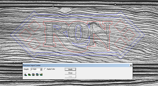
The last workshop (like most of them) will be a full house. We had a flurry of last minute sign-ups and so we are busy making a few more name plaques. That too has been a fun and learning experience with over 300 unique name plaques designed and routed through that decade. The last name plaque for the workshops belonged to Ron. Like most of the others the design is one that makes me think a little and used a variety of functions in EnRoute. The vectors were created in EnRoute of course.


The last workshop (like most of them) will be a full house. We had a flurry of last minute sign-ups and so we are busy making a few more name plaques. That too has been a fun and learning experience with over 300 unique name plaques designed and routed through that decade. The last name plaque for the workshops belonged to Ron. Like most of the others the design is one that makes me think a little and used a variety of functions in EnRoute. The vectors were created in EnRoute of course.
I first created a flat relief that was 0.6" tall.
Then I modified this flat relief using the dome tool and a pill shaped vector that was drawn around our relief.
I then used the subtract from (flat relief) tool to drop the centre portions around the diamonds and lettering outline.
I then imported a sandblasted woodgrain bitmap (from the TEXTURE MAGIC COLLECTION ) and enlarged it before applying it to the sunken portion of the relief.
I then used the bevel tool to create the diamonds at each end of the name plaque.
The last step was to use the bevel tool to shape the letters.
Tuesday, April 19, 2016
Dino permanent installation
We fabricated the raptor skeleton with the help of EnRoute and our new plasma cutter from MultiCam a while back. The permanent placement had to wait for good weather.
With the return of summer lately we are getting started on finishing a little more landscaping around the yard. A few weeks ago we prepped the ground and rolled out some turf. It sure cleaned things up in a hurry. Once the grass was down we could do a final install on the dinosaur sign. The rust patina has really evened out over the winter months and it is looking pretty fine! I'll cut in a flower bed around it in a week or two when it is time to plant the annuals. Will it encourage the look-loos to make an appointment before coming on our property? I doubt it but it does finish off the area beside the driveway very nicely.

With the return of summer lately we are getting started on finishing a little more landscaping around the yard. A few weeks ago we prepped the ground and rolled out some turf. It sure cleaned things up in a hurry. Once the grass was down we could do a final install on the dinosaur sign. The rust patina has really evened out over the winter months and it is looking pretty fine! I'll cut in a flower bed around it in a week or two when it is time to plant the annuals. Will it encourage the look-loos to make an appointment before coming on our property? I doubt it but it does finish off the area beside the driveway very nicely.
Thursday, April 14, 2016
Last chance
This afternoon we converted our work space into a learning space. Our crew did an amazing job, excited to greet our visitors. In the late afternoon our guests began to arrive, eager to begin the Sculpture Magic Workshop. We have a wonderful and diverse group. This is going to be fun!
In two weeks we'll be holding a second Sculpture Magic Workshop. There are still a couple of seats available in that workshop.
We have decided it will be the last one. We've thoroughly enjoyed hosting these workshops for the last ten years and have met so many wonderful people from around the world. Our current workload and project schedule into next year and well beyond simply doesn't allow us to continue hosting these events. It's been a most marvellous and fun ride!

Tuesday, April 5, 2016
Strong bones
The pieces we are building for Motiongate in Dubai are the most engineered we have ever done. We created the first drawings of the incredibly strong frameworks that go inside the features. The target feature frame is a giant triangle truss that measures six feet wide by thirty feet long and three feet high. Our engineer then reviews our drawings, calculates the proposed forces and adds what he feels necessary. Our client's engineers then reviews these drawings, before they are sent on to the client in Dubai. They send their notes back to our client and then on to us and our engineer for final changes. After the lengthy process is done we can at last begin the build.


Then it was time at last to begin the fun stuff. We prefabbed the head and tail of the Viking shipwreck and then placed them with the forklift before welding them firmly in place. This thing is pretty massive and will get a lot bigger yet as we add the rockwork and other bits of the ship around these first two elements.

All of the drawings were created in EnRoute full size. This ensured accuracy and also allowed us to create the cutting files for the plasma cutter at the same time. We exported the drawings as DWG files so the engineers could work on the plans in AutoCad. We gave our MultiCam plasma cutter a good workout on the heavy plate steel. Today we finished the true framework for the base.
Then it was time at last to begin the fun stuff. We prefabbed the head and tail of the Viking shipwreck and then placed them with the forklift before welding them firmly in place. This thing is pretty massive and will get a lot bigger yet as we add the rockwork and other bits of the ship around these first two elements.
Subscribe to:
Posts (Atom)