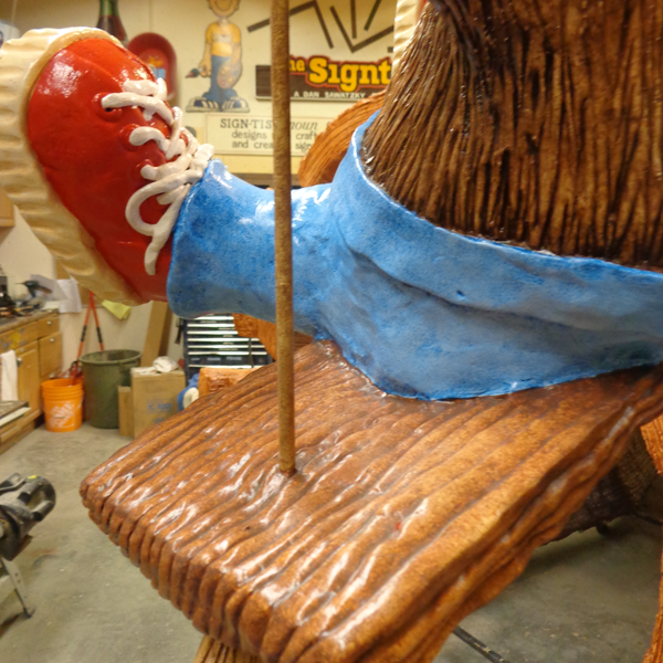
We design texture into our signs so they capture light better and also accept glazes better. This makes the sign look better and cuts down our painting time. In our glazes we almost never use less than there shades and most often use three. These are applied from lightest to darkest. The first glaze is only rubbed off slightly revealing only a little of the base color at it's full bright hue. The next darkest glaze is rubbed off a little more showing through the lighter glaze and bits of the base color as highlights. The final, darkest glaze is rubbed harder except on the edges and around the lettering. This gives the piece a richness and depth and makes the letters jump when we are done.
The border around the letters is painted with a dark paint, the same hue as our darkest glaze. I designed the routing files so the border and the lettering is raised making the cutting of these areas pretty simple. The lower areas are painted up onto the upper areas so we only have to cut once. This provides a dark border around our light colored lettering.
Since I didn't get examples of the current signs I had to dig back through some old projects to illustrate my procedure. This was a farm sign we painted similar colors. The background got it's three coats of light base color and then I started in on the glazes with the lightest color being first. This was wiped enough to reveal the base colored highlights on the high areas, leaving the glaze in the lower areas. The dark paint on the edges is the last glaze color which is painted as a solid color (three coats) on the back.
Here's the same project with the second (and last glaze). Notice how it is not wiped as hard at the edges and around the lettering leaving these areas a touch darker. Once the glaze is dry I then go back in with a paint that is the same hue as the darkest glaze and paint around the border of the letters making sure I paint up onto the top of the letter. Most times I will cover the letters. Notice the dimensional pictorial is not yet painted. Glazing is MESSY and so we leave our fancy paint work until the end so it does't get messed up.
In this shot we've painted the pictorial, and added one glaze to it. Then we paint (or in this case gild the top surface of the letters The raised edge makes this pretty easy and fast and does not require nearly as much skill as you would imagine.
Back to our current examples... In this case the sign background had a blended surface with only a little texture. we did not apply any glazes to these areas. But we did paint the raised letter border a dark color to make the yellow letters pop against the blended blue background. Like the first example the dark blue was painted up onto the letter tops. Then as a last step the yellow was painted on. It took four coats to cover well.
The jean base colors were then carefully cut as needed and the dark blue glaze brushed on and then patted off. The red shoe tops, the shoe laces and his eyes were the last areas to get paint.
Hailey did the painting of the Wave Swing sign. She has worked for us about a year. Prior to that she would have insisted she wasn't particularly artistic and would never be able to pull off something like this. Obviously she was wrong about that. But she has also worked hard to build up her experience and skill. It sure shows here. Nice job Hailey!
-dan


